

In Today’s data era, it is very important to represent data in a way which is suitable for every type of user (Technical or Non-Technical). Use of data visualizations is getting increased exponentially. We have various data visualization tools available in the market such as QlikView, Power BI, Tableau, Google DI studio.
Power BI provides an advantage to create custom design/custom visual of any image, maps, floor plans not restricted to geographical maps. Visuals can be dynamically designed based on the values of the measures such as Colours. Synoptic Design by okViz assists users to accomplish this task.
This tutorial will guide you through a step by step process of how to use the synoptic panel in Power BI.
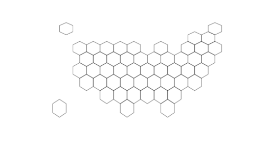
Step 1: Download any image of your choice or requirement. For example, a hex map of USA as shown below:
Step 2: Open a web browser (Google Chrome, Internet Explorer, etc) and go to http://synoptic.design and drag your chosen image on the canvas.
 Image 2

Image 3
Step 3: Now you can select the area you want to label your map. Place the cursor on the canvas and it will automatically select the area and create yellow coloured boundary shown in Image 4 :
 Image 4
Alternatively, you can write the area coordinates and it will display the selected area on the canvas.
Step 4: Like step 3, you can select multiple areas and label them as per your requirements as shown in image 5.
 Image 5
Step 5: Once you are done selecting areas and labeling them. You can export the image by clicking Export to Power BI button present in the bottom right corner of the website(Refer Image 6).
 Image 6
Once you select Export to Power BI, a pop up will open and you can then right-click the image and save image as “.svg” file at your desktop.
 Image 7
Step 6: Open Power BI on your desktop and import your dataset into .pbix file and import synoptic design by okviz from the store. Then select category and measure and drag them to the visualization as shown in Image 8.
Image 8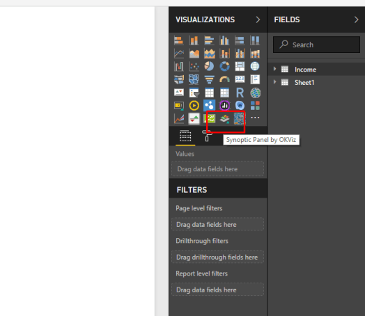
And Output will be displayed as
 Image 9
Step 7: You can change the intensity of the colors while changing states by applying rules as desired by the business problem and final output will look similar to image 10.
Image 10
You can play with the visualization as per your requirement and change the variables and states accordingly.
